Showing posts with label wet-to-dry. Show all posts

Wednesday, November 16, 2011

"100 SLC Porches, No.89, 90, & 91"

I've been busy painting away and also have had some computer problems.  So here's a bit of catching up with the last three that I've painted of the 100 Salt Lake City Porches Art Project...

"100 Salt Lake City Porches, No.89"; a Poured Watercolor on 12" x 15" -300 lb Cold Press Paper.
There was so much cute and color to the above porch that I felt it lend itself naturally to a pour watercolor.  I used some 300 lb. weight watercolor paper for this poured watercolor.  I did 4 different pours and then finished with a bit of puddle painting.

"100 Salt Lake City Porches, No.90"; Watercolor on 10" x 15" Paper.
The last of the Halloween decorated porches (and there were a GREAT deal to chose from), I decided to do in a sepia-colored gray.  I thought it helped play up a "spooky-ness".  I just LOVED the line of chained arms reaching out of the ground and the cemetery that lays off to the side as you approach the porch.  These porch owners really like Halloween and they've got a fun sense of humor about it too.  The first gravestone to the right says..." Myra Mains.... I told you I was sick!"  There was even more humor as you went along and read some of the other gravestones.


"100 Salt Lake City Porches, No.91"; Watercolor on 12" x 16" Paper
This porch belongs to my watercolor painting teacher and I'm very curious to see what she thinks.  I decided to do it at a different close up angle to give it more interest.  She had SO many pretty flowers out this last summer while I was over there doing a bit of cat sitting for her.  I took the camera shot in the late evening and the sun only caught part of the top corner of the south facing porch and the upper of the tall evergreen.  I did this in a wet-to-dry style.  I hope she likes it and I'll find out tonight.  To view the progress of (or to purchase one of) the 100 Salt Lake City Porch Project, please click here.  Thank you for visiting and I welcome any feedback you may have.

Tuesday, October 11, 2011

"100 SLC Porches, No.82"

It was a sunny warm Fall day when I went by on my bicycle and saw this porch.  The angle of the light made the evergreen shaped spirals dramatic and I thought they would be fun to paint them.  It was fun and here it is number 82...
"100 Salt Lake City Porches, No.82"; Watercolor on 12" x 11" Paper
I started to do this painting in the wet-to-dry method but then as it dried I switched to the puddle style method to work on the foreground with the spiraling topiary and the pot of golden mums on the porch. I really had fun with this painting.  To view the progress of (or to purchase one of) 100 Salt Lake City Porches, please click here.  I welcome any feedback you may have.  Thanks for stopping by.

Friday, September 16, 2011

In A Flowering Mood...

I've been in a bit of a flowery mood of late and am wandering into uncharted territory.  As a co-worker stated recently," I never imagined you as the flowery type."  I will admit that I usually am not, being more of the tom-boy type.  But it's kind of been nice trying my hand at something new.  Here's a couple of recent watercolors, I've done in the wet to dry method...
"Poppies A Blooming"; Watercolor on 9" x 12" Paper.

"Crab Apple Blossoms"; Watercolor on 10" x 13"
I'll probably start back in with the 100 Salt Lake City Porches Project this weekend and I'm hoping to be able to scout out some new porch possibilities on my bike too.

Monday, September 12, 2011

A Porch Break...

I'm taking a short break from the 100 Salt Lake City Porches Art Project this week.  Part of the reason is that I need a bit of a break and want to paint other things. I've had some photos I have taken while out scouting porches and cycling that I've wanted to paint but just haven't had the time.  Well, I thought I would take a bit of a time out this week to paint some of those.  I also have started back with Colleen Reynolds Watercolor Classes.  I took the summer off because I ride my bike WAY TOO much in the summer to have time for everything.  Like this painting below, I've had a photo I took back at the beginning of summer of these birdhouses.
"Birdhouses in a Row"; Watercolor on 10" x 12" Paper done in the wet-to-dry method.

Another part of the reason is that I am taking a break.  I am in need of some more porches to paint.  I've managed to get quite a variety relatively close to where I live and bike on a regular basis but now I need to venture out a little further in the Salt Lake City valley to look for some unique porches.  It takes a bit more time.  If any of you that are reading this know of some porches that are unique, please drop me an address via email (its2allgood4u@yahoo.com ).  I would be very grateful.

Thursday, August 18, 2011

"100 SLC Porches, No.70"

"100 Salt Lake City Porches, No.70"; Watercolor on 10" x 12" Paper
This porch painting I did as a cross between a wet-to-dry method and a poured watercolor style with a bit of puddle watercolor painting.  So I guess you could say I used no one particular style in a way. :)  I did narrow down the color scheme at least.  I used kelly green, indigo blue, and dioxazine violet.  To view the progress of 100 Salt Lake City Porches (or to purchase) click here.  I welcome any feedback you have have!

Tuesday, July 26, 2011

"100 SLC Porches, No.63"

"100 Salt Lake City Porches, No.63"; Watercolor on 10" x 11" Paper
There's a great deal going on with this porch and I decided to do it in the wet to dry style of watercolor painting.  I limited the color pallet to quinacridone gold, ultra marine blue, and kelly green.  This went quickly as usually the wet to dry style does.  You can view the progress of the 100 Salt Lake Porches or perhaps to inquire about purchasing, click here.  Thanks for visiting and I would enjoy any feedback you may have.

Monday, June 6, 2011

"100 SLC Porches, No.49 to No.52"

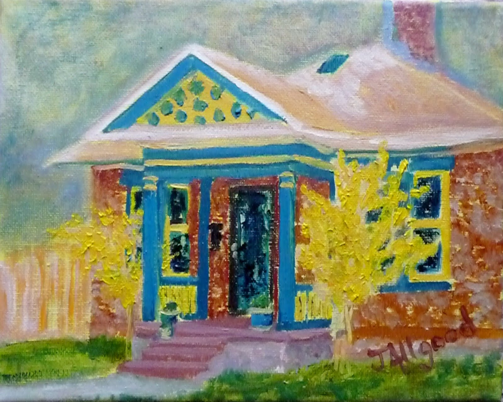
I was REALLY in the mood to paint this weekend and managed to get 4 of the 100 Salt Lake City Porches done.  And here they are in order...
"100 Salt Lake City Porches, No.49"; Oil on 12" x 12" Wrapped Canvas
No this is not the original painting I had planned to paint.  That porch painting is still off to the side.  This porch painting in oil came together quickly.   This sunny porch was scouted out by a friend and I think what drew us both to this porch was the ceramic tiled square areas on the lower areas of each side of the porch.  I also liked the fish mail box too.  I kept to a pastel pallet on this one.

Below Porch #50 was also spotted by the same friend.  I loved the red tree and went a bit brighter with it.  This watercolor was a combination of flat washes, puddle painting, and sponge painting.

"100 Salt Lake City Porches, No.50"; Watercolor on 9" x 13" Paper

Porch #51 has an Old English feel to it.  I did this watercolor in a wet to dry method then did a bit of puddle painting to finish it off.  I kept to a raw umber, indingo blue, and yellow mix (medium yellow & yellow ochre) pallet.
"100 Salt Lake City Porches, No.51"; Watercolor on 9" x 10"Paper

Porch #52 belongs to a co-worker who had reserved the number because it was her age.  I really think she wanted me to get more porches under my belt before I attempted hers.  I surprised her at work this morning, and she was delighted with it.
"100 Salt Lake City Porches, No.52"; Poured watercolor on 9" x 10" Paper
Click here to see the "100 Salt Lake City Porches" Art Project page.  Check out my progress or get info. on how to purchase a porch painting.

Wednesday, May 25, 2011

"100 SLC Porches, No.47"

"100 Salt Lake City Porches, No.47"
Watercolor on 10" x 14" Paper
You don't see many of these...a double level porch!  They just don't seem to build large tall houses like this anymore.  I imagine it's wonderful view from that top porch area; as this house is on a bit of a hill.  The original house has dark almost black browns, grays, and red brick.  I opted to limit the color pallet to two colors; an indigo blue and the lovely quinacridone gold. (Please don't ever ask me to pronounce what kind of gold this is.  I'll surely screw it up!)   I used the wet to dry watercolor painting method.  It went pretty fast and it was a fun painting to do.  I welcome any feedback you may have.  Please visit this page to view the progress of 100 Salt Lake City Porches.  Thank you.

Thursday, April 28, 2011

Some Bike Art...

"The Girlie Duo"
9" x 11" Watercolor on Paper
I've been taking a bit of a break from porches, and dabbling in some bike art.  In the week, I've done three watercolor paintings with bikes. This painting pictured above is the last of the three.  I did it during last night's watercolor painting class.  Colleen Reynolds, my teacher, seems pleased with my progress of watercolor painting.  This painting was done in the wet-to-dry style.  The two other watercolor paintings are currently being framed and I'm hoping they will appear in the Salt Lake City Gallery Roll.  They are still taking bike art entries, if anyone out there has bike art that they would like to display.  Check out this site!

Wednesday, April 27, 2011

"100 SLC Porches, No.38 & No.39"

"100 Salt Lake City Porches, No.38"
Poured Watercolor on 10" x 11" Paper
I've been admiring this porch for awhile.  It is along one of my favorite bicycle routes; some of my cycling friends have referred to this route as my "Realtor" route.  I like to ride along nice quiet residential streets where there is less traffic.  I sometimes like to imagine this porch attached to a turreted castle; similar to the Knights of the Round Table.  It has that quality about it.  I also enjoy the wrought iron fence that opens on to an "S" curved stoned walk that leads to the porch.  It all adds to the majesty of it.  I chose four colors for this poured watercolor; indigo, crimson, burnt umber, and kelly green.  I thought that doing it as a poured watercolor gave it a sense of mystical.  I finished it off with a bit of puddle painting.

" 100 Salt Lake City Porches, No.39"
Watercolor on 10" x 11" Paper
 I found this porch nested in a quiet neighborhood and thought it most striking.  I must admit that I want to go back and visit it when the landscape is not covered with snow; as what has been happening with recent Utah weather.  Spring in Utah!  I love the oriental peaceful feel of it, and can imagine that the landscaping will reflect this feeling.  I did this in the wet-to-dry method of watercolor painting to bring out the strikingness of this porch.  To view all of the Salt Lake City Porch Paintings visit this page.

Thursday, April 14, 2011

"100 SLC Porches, No.36 & No.37"

"100 Salt Lake City Porches, No.36"
Oil on 8"x10" Canvas
I was drawn to this porch by the bright yellow trees flanking the porch.  Then continued to look at the porch when the yellow accent trim matched the trees.  It made me wonder about the age old question of..."Which came first--the egg? Or the chicken?"  So, were the trees first and then someone went to the local paint store with a leaf to match the paint?  Or was the yellow painted first and then the trees planted to match?  I was very tempted to knock on the door to ask; but I didn't.  If I ever find out the answer I pass it along.  Though, I must admit that I sometimes lean toward enjoying the unanswered questions.

"100 Salt Lake City Porches, No.37"
Watercolor on 10" x 11" Paper
This porch is very striking in the afternoon sun and that was the reason I chose to do this porch in a wet-to-dry method of watercolor painting.  I used the three colors of phthalo blue, raw sienna, and yellow ochre.  I slowly built up the shaded areas with phthalo blue and raw sienna.  Then, highlighted some areas with the yellow ochre.  This painting came together very quickly.  To view the progress of the 100 Salt Lake City Porches visit this page

Monday, April 11, 2011

"100 SLC Porches, No.35"

"100 Salt Lake City Porches, No.35"
Watercolor  on 10" x 11" Paper

For this porch watercolor painting, I used the wet to dry method.  I lightly drew in the porch with pencil and did a bit of shading.  In this method, the focus seems to be on negative painting.  Focus in on the shaded areas slowly, little by little building those up to be darker.  I did do a bit of dry brushing in the foreground to put some emphasis on the rock path that goes to the porch. I decided to use cerulean blue, dioxazine purple, and yellow ochre.  I really find the muted quality of blended colors wonderful.  I welcome any feedback you may have.  Please check out the progress of the porch paintings on the 100 SLC Porches page.

Thursday, February 3, 2011

"100 SLC Porches, No.15"

"100 Salt Lake City Porches, No.15"- watercolor on 8.5" x 11" paper
I did most of this porch at watercolor painting class last night learning a new style of "Pouring It On".  Colleen first showed examples photos of the "Pouring It On" style of paintings.  The first examples she showed were from the painter Lian Quan Zhen.  He does a method of pouring watercolor that's more of a Chinese Watercolor Pouring on Style.  Next, she showed paintings from Leslie Redhead who does a pouring on method that is one color at a time.  Both of the styles of pouring watercolor were amazing.  I especially loved the building scene paintings done by Leslie Redhead.

Out of necessity, Colleen said we will limit this month's watercolor painting class to the Chinese style of pouring on.  The one color at a time does not work well in a class situation because it needs more time.  There is a waiting for one color to dry completely before you pour another color.  But she did suggest that we try this style as homework. 

Next, Colleen did a demo of the Chinese watercolor pouring on style.  She had all ready drawn and masked off the white areas of ducks in a pond.  She then mixed 3 paints in separate cups; one blue, one red, and another yellow.  She misted the sketched/masked off paper with her spray bottle.  Then, she poured the blue in the area of the painting that would mainly be blue.  Then, she poured with the yellow paint cup the areas that would be yellow or possibly green with overlapping of the blue.  She took her fingers and moved the paint around on the paper to mix in certain areas.  Also, dropping some of the paint in other areas for spots of green or yellow.  Next she poured on the red paint in areas that the red would be.  Then, took her fingers again and moved paint around on the paper mixing.  She also took a straw and did some blowing through it to move paint around showing the different effects.  Then, she took some paper towels and absorbed some of the extra paint. 

As the painting started to dry Colleen showed us how we could do interesting things to the painting as it dried.  She showed how we could take a thirsty brush and pick up paint to almost make pale white areas with gentle edges; unlike the harsher edges that masking achieves.  She also put salt (both table & sea salt) on the painting.  Then, there was an application of saran wrap to make subtle effects.  I was getting excited by all of the possibilities~!

I then started my own pouring on painting.  I had all ready drawn and quickly did a bit of masking while I mixed my 3 cups of paint.  When it was time for the actually pouring on I quickly discovered that it was harder than it looked!  I ended up with a bit of a psychedelic mess!  But with some work and some wet to dry painting, I finally ended up with the above painting which was a pleasant surprised.  But I think this is going to be a learning curve type of thing.

Thursday, October 28, 2010

Tone-it-Up Or Tone-it-Down: Wet-to-Dry Painting

At last night’s water color painting class, the focus was color tone with a wet-to-dry style of water color painting exercise. Tone implies color where value is the “grays” scale. Something just “clicked” and I finally actually understood the concept after this class. That’s amazing considering I’ve been taking art lessons off and on for years!

Colleen first showed us a tonal chart which had the gray scale on one end. Then, she spoke about the tint of a color is to lighten the color. In water color to tint, or lighten, the color you use more water. Next we learned about the shade of a color is to darken the color. In water color to shade the color you use the color’s complimentary color. So get out your color wheels and check to see what’s opposite. I happen to have almost gotten the color wheel beaten into my head enough over the years that I’ve absorbed it through osmosis! Some things just seem to sink in over time.


So for our exercise this week was our last of the wet-to-dry style of water color painting. We got to choose between two photos; one with evergreen trees covered in snow, or one with what I called a winter barn scene. Everyone chose the winter barn scene. This is what mine ended up looking like after I did a bit of finishing touches when I got home.

"Winter Barn"- wet-to-dry style water color on 9"x12" cold press paper.

For homework this week, we are supposed to do one more wet-to-dry watercolor with a good example of color tone, and then, do a tonal chart like the one Colleen showed us in class—which looks like this…

Color Tonal Chart-- my homework, YUCK!
Admittedly, I’m not too excited about doing the tonal color chart.   Hmmmm… maybe the “dog ate it” excuse?  Can you tell I'm not really a good student?

Oh, and P.S.--The wet-to-dry style?  Well, up until last night I've been referring to it as wet-on-wet.  We've only been doing it four weeks and I'm just catching on to that!  Yeah, I'm not the smartest pupil in the class!