Thursday, April 28, 2011

Some Bike Art...

"The Girlie Duo"
9" x 11" Watercolor on Paper
I've been taking a bit of a break from porches, and dabbling in some bike art.  In the week, I've done three watercolor paintings with bikes. This painting pictured above is the last of the three.  I did it during last night's watercolor painting class.  Colleen Reynolds, my teacher, seems pleased with my progress of watercolor painting.  This painting was done in the wet-to-dry style.  The two other watercolor paintings are currently being framed and I'm hoping they will appear in the Salt Lake City Gallery Roll.  They are still taking bike art entries, if anyone out there has bike art that they would like to display.  Check out this site!

Wednesday, April 27, 2011

"100 SLC Porches, No.38 & No.39"

"100 Salt Lake City Porches, No.38"
Poured Watercolor on 10" x 11" Paper
I've been admiring this porch for awhile.  It is along one of my favorite bicycle routes; some of my cycling friends have referred to this route as my "Realtor" route.  I like to ride along nice quiet residential streets where there is less traffic.  I sometimes like to imagine this porch attached to a turreted castle; similar to the Knights of the Round Table.  It has that quality about it.  I also enjoy the wrought iron fence that opens on to an "S" curved stoned walk that leads to the porch.  It all adds to the majesty of it.  I chose four colors for this poured watercolor; indigo, crimson, burnt umber, and kelly green.  I thought that doing it as a poured watercolor gave it a sense of mystical.  I finished it off with a bit of puddle painting.

" 100 Salt Lake City Porches, No.39"
Watercolor on 10" x 11" Paper
 I found this porch nested in a quiet neighborhood and thought it most striking.  I must admit that I want to go back and visit it when the landscape is not covered with snow; as what has been happening with recent Utah weather.  Spring in Utah!  I love the oriental peaceful feel of it, and can imagine that the landscaping will reflect this feeling.  I did this in the wet-to-dry method of watercolor painting to bring out the strikingness of this porch.  To view all of the Salt Lake City Porch Paintings visit this page.

Thursday, April 14, 2011

"100 SLC Porches, No.36 & No.37"

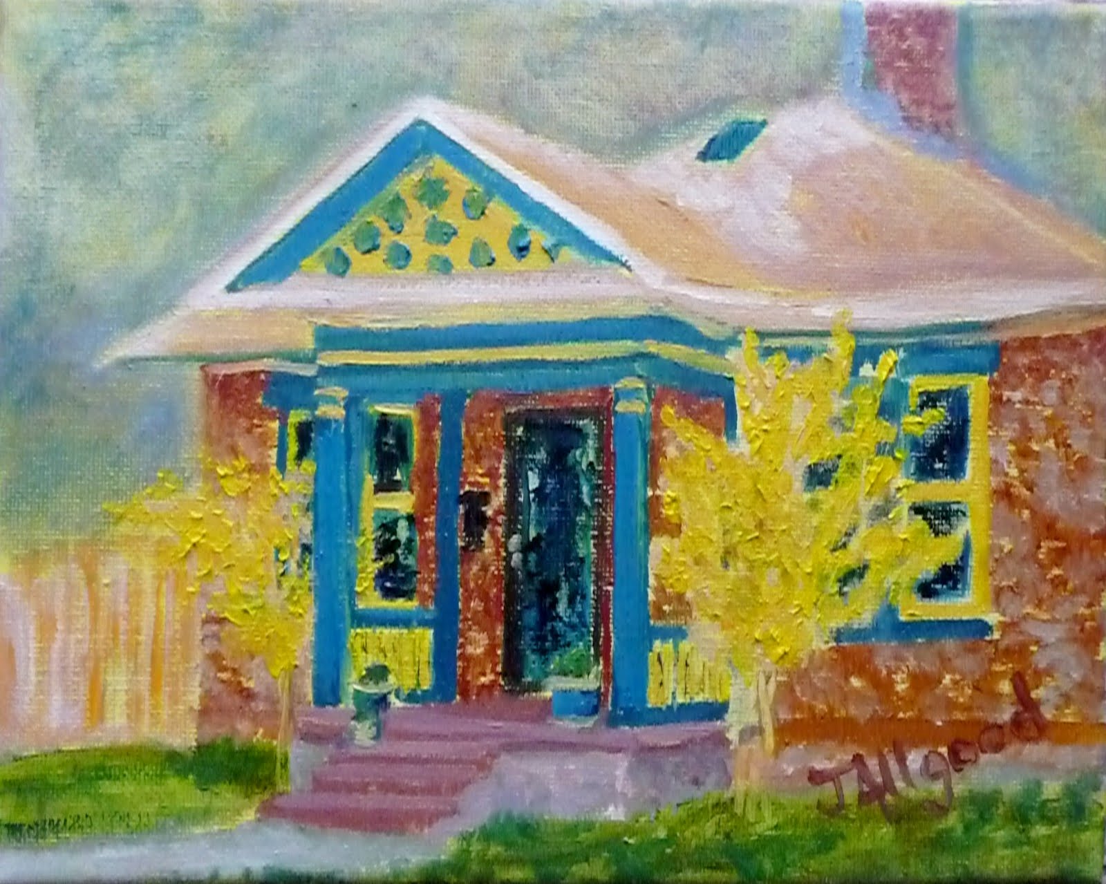
"100 Salt Lake City Porches, No.36"
Oil on 8"x10" Canvas
I was drawn to this porch by the bright yellow trees flanking the porch.  Then continued to look at the porch when the yellow accent trim matched the trees.  It made me wonder about the age old question of..."Which came first--the egg? Or the chicken?"  So, were the trees first and then someone went to the local paint store with a leaf to match the paint?  Or was the yellow painted first and then the trees planted to match?  I was very tempted to knock on the door to ask; but I didn't.  If I ever find out the answer I pass it along.  Though, I must admit that I sometimes lean toward enjoying the unanswered questions.

"100 Salt Lake City Porches, No.37"
Watercolor on 10" x 11" Paper
This porch is very striking in the afternoon sun and that was the reason I chose to do this porch in a wet-to-dry method of watercolor painting.  I used the three colors of phthalo blue, raw sienna, and yellow ochre.  I slowly built up the shaded areas with phthalo blue and raw sienna.  Then, highlighted some areas with the yellow ochre.  This painting came together very quickly.  To view the progress of the 100 Salt Lake City Porches visit this page

Monday, April 11, 2011

"100 SLC Porches, No.35"

"100 Salt Lake City Porches, No.35"
Watercolor  on 10" x 11" Paper

For this porch watercolor painting, I used the wet to dry method.  I lightly drew in the porch with pencil and did a bit of shading.  In this method, the focus seems to be on negative painting.  Focus in on the shaded areas slowly, little by little building those up to be darker.  I did do a bit of dry brushing in the foreground to put some emphasis on the rock path that goes to the porch. I decided to use cerulean blue, dioxazine purple, and yellow ochre.  I really find the muted quality of blended colors wonderful.  I welcome any feedback you may have.  Please check out the progress of the porch paintings on the 100 SLC Porches page.

Friday, April 8, 2011

"100 SLC Porches, No.34"

"100 Salt Lake City Porches, No.34"
Pour Watercolor on 9" x 11" Paper
I found this Frank Lloyd Wright inspired porch nestled in a quiet Holladay neighborhood during a recent bicycle ride.  I found it a challenge to narrow down to just the porch area of this home.  There's brick, stone, wood, steel, and colorful glass in the front door windows all set amid an understated landscape.  I decided to use four colors for this poured watercolor; ultramarine blue, cadmium red medium, hooker's green, and yellow ochre.  I added the green to this pour because there's a great deal of green undertones in the wood of the door and there was a fair amount of a wonderful green in the glass of the door.  The other challenge with this porch is that one side was in shade from the rest of the house while the other half was enveloped in warm sunshine.  There were areas of snow that were reflecting light too.  I would love to hear any feedback you may have on this one.  Please check out the progress on the 100 Salt Lake City Porches page.

Tuesday, April 5, 2011

"100 SLC Porches, No.33"

"100 Salt Lake City Porches, No.33"
Oil on 16" x 16" Canvas
I call this gem of a porch the Cape Cod Mansion.  The house reminds me of a house you would find not far from the Cap Cod area.  I can just imagine feeling the sea breeze on my face.  I really brought out the blues in this painting and I especially enjoyed the white arch with columns around the porch area.  To view the progress of the 100 Salt Lake City Porches click here.