 |
| "100 Salt Lake City Porches, No.6"- watercolor on 10" x 13" paper |
Monday, December 20, 2010
"100 SLC Porches, No.6"
Tuesday, December 14, 2010
"100 SLC Porches, No.5"
 |
| "100 Salt Lake City Porches, No.5" - 12" x 16" oil on canvasboard |
Monday, December 13, 2010
A New Area for Watercolors...
I've created a new area to show off my watercolors. I just felt that the watercolor paintings needed their own area to be displayed. As I am discovering that watercolor as a medium is quicker to produce an end piece of art. Therefore I'm figuring that I'll probably have more watercolors to show and thus I'm trying to plan ahead for an area where I can display all of those watercolor paintings. Please check it out when you get the chance. WATERCOLRS or click the WATERCOLORS with photo link down along the righthand side of my Allgood Art Blog. I welcome any feedback you may have.
Wednesday, December 8, 2010
"100 SLC Porches, No.4"
 |
| "100 Salt Lake City Porches, No.4"- watercolor on 11"x14" yupo paper |
Monday, December 6, 2010
"100 SLC Porches, No. 3"
 |
| "100 Salt Lake City Porches, No. 3"- oil on 11" x 14" canvasboard |
Wednesday, December 1, 2010
"100 SLC Porches, No.2"
Here it is, I finished it last night...
I was fasinated with this porch because of all the fallen leaves and snow. Obviously, not a well used porch. I chose to do it in watercolor because it has so much white that I thought it would translate well.
 |
| SLC Porch, No.2- 10" x 14" watercolor on cold press |
Tuesday, November 30, 2010
"100 SLC Porches, No. 1" - The Beginning
I’ve decided to do an art project that was partially inspired by a fellow blogger. For quite a while now I’ve been enjoying the “100 Faces” of artist Karin Jurick on her blog – A Painting Today. Each new face she has painted has been unique and I am in awe of her talent. I thought it also might be a good way to challenge myself as a painter by doing “100 of” something. But I’m not talented enough yet to step up to "100 Faces" but maybe something else. But what? The idea has been simmering in the back of my mind for awhile.
 |
| SLC Porches, No.1- 8"x10" watercolor on cold press |
So this last Thanksgiving holiday as I was walking/jogging, trying to burn some of those consumed calories, an idea struck! For some reason as I was going along I was noticing the porches on houses. There’s a great deal of variety of houses along my favorite route, and I will admit that is part of what has made it my favorite. Each house is unique and I was finding myself focusing particularly on the porches. Each porch is unique and I couldn’t help but feel I was being given a glimpse of the people who dwell in each house. The more and more I looked at all of these porches; I saw all of the variety and the possibilities. Boom! The light bulb went on, and I thought to myself. Why not? “100 Salt Lake City Porches”!
This last Saturday during my walk I took my camera and snapped photos of about 30 different porches. I’m not sure if all of them will translate to paint well, but it’s a start. I'm playing with the "game plan" of doing 2 porches a week. But I really don't want to focus so much on time restraints. I want to feel that I'm doing proper justice to each unique porch. I, also, want to allow room for artistic inspiration, and maybe for some that might be considered a "cop-out". But any of you that know me, know that once my mind is set on something I can be darn tenacious. I may from time to time need a "break" from porches and may feel inspired to paint something else from time to time. Thus, I'm not really giving myself a dead line to finish these 100 SLC Porches. Sunday I sat down and painted the first of many.
Oh, and if anyone sees a Salt Lake City
Tuesday, November 23, 2010
Mom's 10 lb. Butterball
 |
| "Mom's 10 lb. Butterball" 11" x 14" oil on canvasboard |
Happy Thanksgiving!
Friday, November 19, 2010
One Scene - Two Approaches
 |
| "Arches - Focus on Light", 8.5" x 11.5" watercolor on cold press |
The above was especially a fun water color painting class experience because it started off as a rose colored wash. Colleen showed me various ways to remove color from a water color painting where the paint has all ready been applied. I rather felt like a chemist as we mixed bleach 50/50 with water. A piece of clear acetate with cut out areas for the lighter areas (like the top arches and the windows within the arches) was placed over the rose colored wash. With the acetate taped down, an old brush was used to apply the bleach/water mix to the rose colored wash. It was interesting to see how the rose color started to disappear. Those areas were then masked off. While the masking fluid was drying, Colleen then showed me the FUN of using wax. Wax was applied to various areas of the painting to give the effect of bricks. I would color wash an area, then apply more wash, and then apply a wash with another color. Layer upon layer; it was almost like building brick by brick and added bits of various colors to each wash to create the end result.
Next, it was on to the shaded areas of the arches. The shade was built; working from greens, browns, and then finally the blues. Then Colleen showed how to remove color from the shaded arch areas to create the feeling of the wrought iron gates. A metal razor blade was randomly and lightly scratched over the dried water color paint. Thus, bit by bit the gates were formed.
 |
| " Arches with a Color Focus" 9" x 12" watercolor on yupo |
So which do YOU like better? I would love to hear your input!
Wednesday, November 17, 2010
Win/Win-- Art, Wine, & More...

Oil paintings displayed in the living room. Some of these were from the Tale of Two Mains show I did in March.

Last week I had my little private art show that I referred to as Art, Wine & More. Overall it was a Win/Win situation, and a BIG thanks to all of those who showed. A box was filled with non-perishable foods and I ended up selling 6 paintings which 10% of the proceeds is going to the Utah Food Bank.


I held the event on both Thursday and Friday. Thursday night I had a couple of people in attendance, and I was kind of getting concerned but I know that I had a few people that had mentioned they were coming on Friday night.

Look at all of these Food Donations!
Friday night arrived and I had a co-worker that came over shortly after work. The co-worker purchased a painting. Then, a friend arrived early and shortly after that my water color teacher, Colleen, showed up. It rather kept up steady with people arriving and leaving until about the last hour. It was during this last hour that a group of friends and myself just hung out in the living room and chatted. While we chatted we enjoyed sipping beverages and sampling food. It was a very fun and relaxed atmosphere.
I ended up having about 13 people overall visit on Friday night. At the end of Friday night, 4 water color paintings and 2 oil paintings had sold. AND the Food Donation Box was practically filled. Wow~! Thus, I'm calling it a Win/Win situation. I even managed to talk a couple of friends into taking some fudge home. Can you say," I don't need that fudge on my hips!"
***- Oh and Mom- the first picture-- that's the chair I was talking about. The one that you re-upholstered which I just LOVE!
Thursday, October 28, 2010
Tone-it-Up Or Tone-it-Down: Wet-to-Dry Painting
At last night’s water color painting class, the focus was color tone with a wet-to-dry style of water color painting exercise. Tone implies color where value is the “grays” scale. Something just “clicked” and I finally actually understood the concept after this class. That’s amazing considering I’ve been taking art lessons off and on for years!
Colleen first showed us a tonal chart which had the gray scale on one end. Then, she spoke about the tint of a color is to lighten the color. In water color to tint, or lighten, the color you use more water. Next we learned about the shade of a color is to darken the color. In water color to shade the color you use the color’s complimentary color. So get out your color wheels and check to see what’s opposite. I happen to have almost gotten the color wheel beaten into my head enough over the years that I’ve absorbed it through osmosis! Some things just seem to sink in over time.
So for our exercise this week was our last of the wet-to-dry style of water color painting. We got to choose between two photos; one with evergreen trees covered in snow, or one with what I called a winter barn scene. Everyone chose the winter barn scene. This is what mine ended up looking like after I did a bit of finishing touches when I got home.
For homework this week, we are supposed to do one more wet-to-dry watercolor with a good example of color tone, and then, do a tonal chart like the one Colleen showed us in class—which looks like this…
Admittedly, I’m not too excited about doing the tonal color chart. Hmmmm… maybe the “dog ate it” excuse? Can you tell I'm not really a good student?
Oh, and P.S.--The wet-to-dry style? Well, up until last night I've been referring to it as wet-on-wet. We've only been doing it four weeks and I'm just catching on to that! Yeah, I'm not the smartest pupil in the class!
Colleen first showed us a tonal chart which had the gray scale on one end. Then, she spoke about the tint of a color is to lighten the color. In water color to tint, or lighten, the color you use more water. Next we learned about the shade of a color is to darken the color. In water color to shade the color you use the color’s complimentary color. So get out your color wheels and check to see what’s opposite. I happen to have almost gotten the color wheel beaten into my head enough over the years that I’ve absorbed it through osmosis! Some things just seem to sink in over time.
So for our exercise this week was our last of the wet-to-dry style of water color painting. We got to choose between two photos; one with evergreen trees covered in snow, or one with what I called a winter barn scene. Everyone chose the winter barn scene. This is what mine ended up looking like after I did a bit of finishing touches when I got home.
 |
| "Winter Barn"- wet-to-dry style water color on 9"x12" cold press paper. |
For homework this week, we are supposed to do one more wet-to-dry watercolor with a good example of color tone, and then, do a tonal chart like the one Colleen showed us in class—which looks like this…
 |
| Color Tonal Chart-- my homework, YUCK! |
Oh, and P.S.--The wet-to-dry style? Well, up until last night I've been referring to it as wet-on-wet. We've only been doing it four weeks and I'm just catching on to that! Yeah, I'm not the smartest pupil in the class!
Monday, October 25, 2010
Three Point Perspective...
I'm a little slow in posting this. I will admit that part of it was because I wanted to finish an example that I started in last week's water color painting class. It's always easier to give an actual example of something than to explain it.
 |
| Skyscrapers in water color and ink- 9"x12" on yupo |
We started off the class by drawing a three point perspective city-scape on type writer paper. I admit part of the reason for type writer paper was because I didn't feel confident about what would turn out of my drawing it. Also, our teacher, Colleen suggested to do a smaller version of the city scene so that we could put all three points of perspective on the sheet of paper. We placed a horizon line very near the bottom of the paper. Then, we place two points of perspective on that horizon. Then, Colleen told us to draw an off center vertical line up to the top point of perspective. Having all three points on the same paper certainly did make it more manageable and ultimately allow us to get an idea of the relationship of the three different points to one another.
After we drew a three point perspective on the type writer paper then we were ready to do some painting. Colleen gave us several different pictures to use. I chose one photo and because of the limited time left in the class I very quickly drew a three point perspective but not as detailed as it probably needed to be done. I decided to do a puddle style on yupo. I have since finished it off with ink after the water color has dried.
The above painting is what I ended up with. Not too bad for a first attempt at three point perspective painting, but there's certainly room for improvement. Also, I managed to finish another puddle style water color on yupo that I started in the make up class that took place last Monday. This one I also played with adding a little ink. What do you think?
 |
| Looking into the Fountain- puddle style water color with ink on yupo- 9"x12" |
Thursday, October 14, 2010
Points of Perspectives in Water Color Painting Class
The word for water color painting this week was "Perspective". Right away we were at Colleen's computer station looking at examples of perspectives. There's 1, 2, and 3 point perspectives. We first talked about one point perspective. Which I will be frank I have never thought of one point before. I know it boggles the mind that at times I can be a bit obtuse! I remember doing two point perspective in high school mostly city scenes with buildings wrapping around corners (that looked really horrible) but one point? I never considered it or really tried to use it before. And well, 3 point perspective... Forgit-a-boud it! But now I can see that it would be helpful to make a building see taller. Not that I'm planning on bounding any sky scrapers on any canvas in the short future.
Colleen showed us several examples of one point perspective (with a bit of 2 point) via paintings from Kathy Weber. What amazing paintings this artist has! I love her use of color-- her use of shading! It's just wonderful! Please check out her blog if you get the chance.
After all those wonderful examples, we were off to do a pencil drawing first of a one point perspective of a building disappearing into the one point on the horizon. Got out those rulers and we drew lines according to Colleen's directions. I ended up doing two different building (right next to each other-- one kind of in front of the other) working on the same one point of perspective. Nothing too elaborate but enough to get a feel for the concept. Next, we chose a photo that had a one point perspective to work on. I chose a black & white photo of a horse out at pasture. Here it is....
So what do you think? I think I did pretty well on the fence's perspective.
Oh, and here's some other paintings that I finished this week...
I even broke out the oils and finished this painting...
Colleen showed us several examples of one point perspective (with a bit of 2 point) via paintings from Kathy Weber. What amazing paintings this artist has! I love her use of color-- her use of shading! It's just wonderful! Please check out her blog if you get the chance.
After all those wonderful examples, we were off to do a pencil drawing first of a one point perspective of a building disappearing into the one point on the horizon. Got out those rulers and we drew lines according to Colleen's directions. I ended up doing two different building (right next to each other-- one kind of in front of the other) working on the same one point of perspective. Nothing too elaborate but enough to get a feel for the concept. Next, we chose a photo that had a one point perspective to work on. I chose a black & white photo of a horse out at pasture. Here it is....
 |
| "Horse at Pasture"-Wet-on-wet style on cold press paper- 9"x12" |
Oh, and here's some other paintings that I finished this week...
 |
| "Red Fall Leaves"- wet-on-wet style on cold press-9"x12" |
 |
| "Confetti'd White Stallion"- wet-on-wet style on cold press- 9"x12" |
 |
| "Cycling Cache Valley's Little Red"- Oil on canvas- 16"x20" |
Thursday, October 7, 2010
Water Color Painting Class-- Saturation!
This week in class there seemed to be a theme—Saturation! First, Colleen discussed about how saturation of a color is relative to the vibrancy or brilliance of that color. Those colors that are lighter; like the yellows/oranges, naturally appear larger and carry more visual weight to that area of a painting. Also, those colors that are higher in intensity, i.e. pure pigments, tend to draw the eye to that area in a painting too. Colleen went on to show us several examples from Monet, Matisse, and other well known artists where they used the concept of color saturation in their composition.
Next we worked on Wet-on-Wet style of water color painting. In this we continued the concept of saturation as we literally were soaking cold press paper until it could no longer take any more water. This is the same method that we used in the prior class when we did the strawberry painting. Here again, we started by lightly drawing with pencil the outline of the painting. Colleen had us focus on the shading area of the painting. Concentrating on the darker and lighter areas of the painting would allow us also to think about the use of color saturation; as well as the values of color. I chose to do a painting based on a photo I taken up at a Sunday Silly Market in Park City. I call this painting—“Is This Hat Me or What?"
And here are a few more of the puddle paintings that I worked on this last week...
Not too bad, huh? I might be improving just a wee bit?
Next we worked on Wet-on-Wet style of water color painting. In this we continued the concept of saturation as we literally were soaking cold press paper until it could no longer take any more water. This is the same method that we used in the prior class when we did the strawberry painting. Here again, we started by lightly drawing with pencil the outline of the painting. Colleen had us focus on the shading area of the painting. Concentrating on the darker and lighter areas of the painting would allow us also to think about the use of color saturation; as well as the values of color. I chose to do a painting based on a photo I taken up at a Sunday Silly Market in Park City. I call this painting—“Is This Hat Me or What?"
 |
| Is This Hat Me or What? - Wet-on-wet style on cold press paper |
 |
| Girls Checking Out Art - water color on yupo paper |
 |
| Spur Exhange - water color on yupo paper |
 |
| Sisters on a Sunny Sunday Afternoon - Water color on yupo paper |
Thursday, September 30, 2010
Meanwhile Back at Water Color Painting Class...
 |
| Sculpture in Garden- water color on yupo paper |
We ended up taking a couple of weeks off from water painting class due to death in my teacher's, Colleen's, family. But last night class was resumed. We started off by showing what we've been doing while class was out. I had three paintings to show for missing two weeks. She critiqued our work and gave up helpful suggestions on how to improve our painting. I really like that about her teaching style. She's positive about what we do but still gives helpful suggestions on how we can improve.
 |
| Tower Against the Sky- water color on yupo paper |
 |
| Biking Along Vine Street- water color on yupo |
Next we were working on our own examples of symmetry. I chose a photo with two different flowered vases to work on. She had me softly draw one vase free hand. Then, she had me stop and decide which half of the vase looked closest to the vase in the photo. We measured top to bottom and side to side; to determine the center point. I drew a line down the center. Then, I erased one half and darkened the outline on the other side that was the "good side".
Tracing paper was placed over the "good side" with the edge down along the center line. Carefully taping the tracing paper along the center line but above and below the drawing area. I, then, drew on top of the tracing paper above the "good side", and flipped the paper over and rubbed along the line I drew on the tracing paper. It left a mark when I removed the tracing paper that I used then to draw a little darker.
Next I drew a second vase from free hand again. I chose the "good side" and then erased the other side. This time I measured up and down the vase from the center line to re-draw the "bad side" to look like the "good side". Then, we got into the fun part.... PAINTING! And thus, I ended up with this painting below...
 |
| Two Vases with Flowers- water color on yupo paper |
Thursday, September 9, 2010
Water Painting Classes- Week 5 & 6- Puddle Painting...
This is my second week and I'm struggling with this style of painting. In Puddle Painting, the painting is divided up into segments. You start off by lightly drawing in the painting. Then you plan you painting in segments. Something that I will admit that I'm not very good at-- planning my painting. Taking each segment of the painting you "puddle" water in that segment then drop color in. It is very different in this style in that you mix the colors right in the painting rather than using a mixing tray. I find this a bit scary in that I'm not always definite on what color I want to use in a certain segment of a painting. Thus, I'm coming face to face with my problem of planning my paintings. OUCH!
I saw improvement in my second week of learning the puddle painting style of water color. Last week's class was a disaster! I ended up throwing last weeks attempt it was SO bad. I will admit that such things don't happen often but it did last week. I had tried to paint a couple of young children leaning on each other. It looked like a couple of lobster-colored aliens that were getting ready for Halloween.
This week Colleen took us through a presentation of visually making our paintings have a sense of spacial feelings. In other words, making our two dimensional paintings look 3-D. We went over several different ways that you could accomplish this-- value, sizing, level of detail, and height on the paper. Colleen showed up several details and also talked about the plains of a painting. Plains is referring to those items that are closer are on a plain and those item that are farther will be on another plain. We need to use these concepts when we are planning our paintings. Ooopps! There's my problem-- planning a painting!
I chose to paint from a photo that I took from my car as I was driving home from my Omaha trip this last week. Photo of the painting is above and believe me-- it's better than last week's attempt. The Highway Home -- I think it looks like a highway disappearing in the distance. What do you think? BUT now I do need to see about getting some practice in! See if I can improve my learning curve just a bit.
I saw improvement in my second week of learning the puddle painting style of water color. Last week's class was a disaster! I ended up throwing last weeks attempt it was SO bad. I will admit that such things don't happen often but it did last week. I had tried to paint a couple of young children leaning on each other. It looked like a couple of lobster-colored aliens that were getting ready for Halloween.
 |
| (Photo- The Highway Home- my second attempt at puddle painting.) |
I chose to paint from a photo that I took from my car as I was driving home from my Omaha trip this last week. Photo of the painting is above and believe me-- it's better than last week's attempt. The Highway Home -- I think it looks like a highway disappearing in the distance. What do you think? BUT now I do need to see about getting some practice in! See if I can improve my learning curve just a bit.
Thursday, August 26, 2010
Water Color Painting Class #4- A Study in Strawberries...
We learned a totally new technique of water coloring this class. It was wet on wet. I also got to finally break open and use my new bottle of masking fluid. Oh boy! Oh boy! Now we're having fun!
First we sat in front of the computer and discussed the 5 varies of shading to make something appear 3 dimensional on paper. I must have picked up more in the University of Utah open draw than what I thought. All of my years of pencil drawing were paying off.
Then, we were drawing a strawberry from a black & white photo on the rough side of the water color paper. Then it was fun with masking fluid. I got to break open the new package on this one. It was a mini version of Christmas. I finally get to play with and figure out what this masking fluid was used for. Yahoo! Colleen, the teacher told us to just lightly put/ poke the paper to make some strawberry seeds on the dark side of the strawberry; about 5 seeds would do. Don't over do it; she told us.
Once that was done then we chose one color and did the strawberry in a monochromatic form. The idea here is that we first need to figure out how to make it three dimensional then we can do it in color once we discover where our darker and lighter values were. I decided to use a mix between paines gray and ultra marine blue.
Next, we did it in color. I played with all kinds of color in the background but kept to mainly strawberry like colors for the actual colored strawberry. Yeah, it might have been a little boring of me. One of the gals in the class did a wonderful dual colored strawberry with a cool red and a wonderful warm burnt sienna. It was wonderful! Another gal did a red with shades of purple that turned out quite nice too.
First we sat in front of the computer and discussed the 5 varies of shading to make something appear 3 dimensional on paper. I must have picked up more in the University of Utah open draw than what I thought. All of my years of pencil drawing were paying off.
Then, we were drawing a strawberry from a black & white photo on the rough side of the water color paper. Then it was fun with masking fluid. I got to break open the new package on this one. It was a mini version of Christmas. I finally get to play with and figure out what this masking fluid was used for. Yahoo! Colleen, the teacher told us to just lightly put/ poke the paper to make some strawberry seeds on the dark side of the strawberry; about 5 seeds would do. Don't over do it; she told us.
 |
| (Photo- my monochromatic strawberry study.) |
We turned the drawn and masked drawing face down on our boards. We took water filled sponges and squeeze water out on to the paper. More and more water; we squeezed onto the paper. Pushing the water with the sponge into the back of the paper. Then, we flipped the paper over. More water was squeezed on to the front of the paper. This side we needed to be careful not to disturb the drawing or the masking. We carefully dabbed more and more water into the paper. The goal was to raise the paper off the board and have it sag easily in you hand. Once that occurred, then we started to sop up all the water off our boards and all of the excess water off of the paper. Then with a rolled up dry tea towel, we rolled it across over the paper on both sides trying to get all of the excess water out. It seemed a little counter to what we had done.
 |
| ( Photo- My colored study of the strawberry.) |
Thursday, August 19, 2010
Water Color Painting Class #3
How time flies I'm all ready into my third class! AND here's a painting that I did between classes... (A bit of homework). Kind of a stormy clouds in background with trees. It's based on a photo that our teacher gave us in the prior class. Though, I will say the sky turned out to be darker than what I thought it would.
 We started out the third class with watching a photo slide show and discussing composition in a painting. It was very informative, and hopefully will help in my paintings overall. It makes me want to go over all of my other paintings and see what I did right and what I did wrong. Hopefully, I have more right than wrong. After the slide show we proceeded into landscapes/over layering painting. This we did over paintings we had all ready done in class. I chose one of the washes that I did in my first class. Here's the result....


This is supposed to be a field with pumpkins with the mountains and trees off in the distance. It still needs some work. But I think I'm seeing some progress?
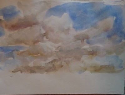
Next the teacher had us work on stormy clouds in a different way. It's like starting with a wash then putting turning the paper so that its vertical in one direction and then turn over the other way vertical before it drips off the paper. Then mix in some gray and work it in a bit. Put in the clouds with a clean moist brush picking up the paint. Then turn the paper vertical one way then the other to allow the paint to work into those clods giving them more a fuzzy stormy look. Well, I will say I was REALLY horrible at this exercise! Here's what I ended up with...


Then we got to learn how to do evergreen trees. These were rather fun and I experimented with several different size brushes on this same sheet of paper. What do you think?

Thursday, August 12, 2010
Water Color Painting Classes- 1 & 2
I've muddled my way through two water color painting classes so far. Last night, I had my second class and I feel like I'm still just barely dipping my toe into it. It's definitely a learning curve and I'm hoping that my learning curve improves as I go along. The first class we worked on washes and then we played with making clouds. My clouds need some work and I'm rather amazed that water colors dry SO MUCH more lighter. We took some of the paintings from the first class and used them again for backgrounds in the second class. I guess that this is fairly common way of doing water color paintings in that you layer them. You paint one segment. Then, let it dry and paint another and so on. The teacher had us hold on to all of our paintings because we are going to still use some of them for landscapes for future. Below are the photos of my water color paintings. I'm documenting this because I'm curious to see how my water color painting progress.
Class # 1-- WASHES & CLOUDS


Class #2-- TREES & STORMY SKIES

Class # 1-- WASHES & CLOUDS


Class #2-- TREES & STORMY SKIES


( I do think that this stormy sky looks pretty good. -- Perhaps, there's hope for me yet?)
Wednesday, August 4, 2010
Starting Water Color Classes...

Thursday, May 20, 2010
Blue Moon Garden - A Tangent into Abstract

Thursday, April 15, 2010
Hanging Artwork
While I'm struggling through trying to paint my next painting ( a version of "Painter's Block"), I thought that I would share some photos of my art hanging in a friend's house. I will admit that I really find it fun and rather an amazing feeling to walk into a house and see my art.

This is becoming more and more common. It's as I paint more and more of my paintings (and they get sold)that they get out there; that I will see them more. It warms my heart, and makes me happy to have my artwork so that it can add color to other's lives and some enjoyment.
Diane, my friend, says that quite often she will be enjoying her morning cup of coffee and look up to enjoy my artwork. These are located in her front room.

Thanks for sharing Diane! If any of you out there have photos of my artwork hanging in your home, I would love to share those here.
Tuesday, March 30, 2010
A Basket of Promise & maybe more...?

I've currently up to having sold 7 of the 30 pieces that were in the Show of A TALE OF TWO MAINS. The other day, I jumped on-line and made donated to the charity that I had chosen for this show.
You see, I feel its just good plain karma to give back when you receive. So I chose a charity-- Heifer International. Please visit their site if you get the chance. I like their Mission, and how they work.
Heifer's Mission to End Hunger
Heifer envisions…
A world of communities living together in peace and equitably sharing the resources of a healthy planet.
Heifer’s mission is…To work with communities to end hunger and poverty and to care for the earth.
Heifer's strategy is…To “pass on the gift.” As people share their animals’ offspring with others – along with their knowledge, resources, and skills – an expanding network of hope, dignity, and self-reliance is created that reaches around the globe.
Heifer’s HistoryThis simple idea of giving families a source of food rather than short-term relief caught on and has continued for over 60 years. Today, millions of families in 128 countries have been given the gifts of self-reliance and hope.
I took a percentage of the paintings I sold at the Show and managed to get a
Promise Basket--A Committment to End Poverty
Give struggling families the promise of a secure future with this special basket, filled with the kinds of livestock our project partners need to add protein to their diets and income to their lives - much-needed income that's used to pay for housing, clothing, schooling and medicine. The basket's geese, ducks and chickens lay eggs that provide nutrition, and the basket's rabbits multiply quickly, ensuring that other families will soon benefit from Heifer's requirement that recipients "Pass on the Gift" of their livestock's offspring.
I have someone else that is interested in another, possibly two paintings, and who knows; I may be able to put a little more towards this charity yet?!
Subscribe to:
Posts (Atom)